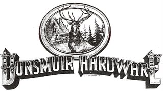
OUR LOGO

Our logo is an important part of our image. In the last 30 plus years it has become widely recognized in our area. When we purchased the store in 1975 it was called L & L HARDWARE - as it had been for a good number of years. The sign across the 50 foot storefront was tired and faded and needed to be redone and we really wanted to change the store's image and establish our own. A name change was needed. We considered McCloud Hardware but gave that up for obvious reasons - confusion with the neighboring town of McCloud and our family name, McCloud. The obvious choice was DUNSMUIR HARDWARE. We were introduced to a local artist - Tom O'Hara - who said he could do our storefront although he had never done anything that big. We liked what we saw of Tom's work and believed that he could do the job but still didn't know just what it should look like. After a lot of thought and research, we arrived at the lettering style and the central oval inspired by an early day Union Pacific Railroad poster advertising the opening of one section of the transcontinental railroad. We felt that it presented a western flavor and was representative of the mountain scenery, wildlife and railroad heritage of the area. Tom did a fantastic job for us and looking back on it now - we wouldn't change a thing. As a matter of fact, over the years we have had the sign re-done three times by other sign painters (Tom has moved on to other things) and we put them under strict orders to not make any changes in the original design. In full color across the storefront in the afternoon sun, it is impressive and was the first visible step in the town's movement to establish it's historic downtown. We're proud of it.

